Thursday, March 12, 2015

Typography Images


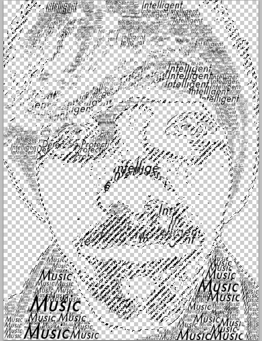
What is typography & how can it be used with images to make a lasting impact?
Typography is the practice of using words or letters in art. It can be used with images to make a lasting impact in several ways. One way it can be used to make a lasting impact is by making it relatable to the audience. Another way it can be used to make a lasting impact is through inspiration, and showing the audience a new approach or goal to something. It can also be used to make a lasting impact through information, spreading knowledge and such.

Describe your biggest challenge during this project. What did you do to overcome the issue?
One of my biggest challenges with this project was following the goals without screwing up, because that is a frequent mistake of mine. In order to overcome such a dilemma, I focused harder and tried again 2-3 times, and at that point, I knew exactly what I had to do. I finished my project exactly how I was supposed to. It also helped to watch several tutorial videos and listen to Mr. Sanderl and his instructions on what to do.

Explain each of your 3 examples, what makes them different, which one is your favorite & why?

My typography innovator picture was done on Nikola Tesla. He is a Serbian inventor from the 1800's, and the father of modern science. I idolize this man.
My typography image of a teacher was done of Mrs. Sanderl. I did this because Mrs. Sanderl is one of my favorite teachers, and the colors match her personality.
My final typography image was done on me. I've been filling in my spaces with words that describe me, like "music" or "intelligent".
On my fully finished image of myself, I used numerous colors, a gradient overlay, bevel & emboss, and the words 'Music, Nerd, Intelligent, Gaming, and Youtube'.

Tuesday, February 24, 2015

Double Exposed Portraits

Portrait photography is photography of a person, and it relates to profile view and silhouetting in several ways. Profile view is the angle of which a picture is shot of a person, where they're looking, what's captured in the image, background details, etc. Silhouetting is the lighting and shadowing in an image, and both are examples of profile photography. Profile photography always has to have a profile view, and every photo has silhouetting (lighting and shadowing) in it.

Double exposure is the act of blending multiple images together to make a transparent image that shows all/both images inside of it.These images are simple to make, and very interesting to see. You can make an image like this in Photoshop by taking a picture of something, and something/several other things. Next, you take the first picture and use the dodge tool, paintbrush tool, or quick-selection tool, to make sure only the pieces that you want of the first image are there, and everything else is white. Next, you make the background white, and use the blend mode function to show everything. The final step is to alter the details of the blend mode and the images and make adjustment layers to perfect the image. You would want to use this kind of image for expression and professional photography.

Explain the symbolism in your 2 visual examples AND how your quality of work could’ve improved.
The symbolism in this picture is to shed light on what kind of a person I am. There's darkness and anger and sadness in the colors, but also a bright green flower, showing the kindness I exhibit.
The symbolism in this picture shows that I have a lot of natural calm in me, despite how I frequently act (I am very hyper sometimes). There is nothing like plants and a small wave crashing to describe serenity.

Monday, February 9, 2015

HDR Photography


What is HDR Photography, what is it used for & what do you like or dislike about it?

HDR photography is photography using (a) converged high-dynamic range photo(s). This means a photo with a lot of bright light and dark shadows, a large range of brightness and darkness. It is used to capture these images for a prettier picture with both included, and I like how good it can make certain scenes look. Using HDR at around sunset can create beautiful images and I like the function for its function.

How do you create an HDR image step-by-step? Is this different from automatic HDR functions & why?

You can create an HDR image step-by-step manually using the exposure function that most professional cameras have. Automatic HDR photos do this too, but the speed is much quicker, the effects sharper, and much less camera shake. This makes HDR pictures much easier to take, and preferable to manual.

Conclude by explaining in-depth the thought process behind at least 2 of your HDR examples.

Getting surrealism into photos was rather difficult. I  decided to take this picture because the sky looked beautiful, and its contrast with the water I believed would be very good. It allowed me to have both the bright sky and the dark, shadowed land in the same picture. I took this photo from a rock, and did my best to capture the full landscape of this area.

I took this photo because I wanted a better picture than what I previously had, and I wanted to capture Seth and the color and background behind him. I did my best to capture his shadowed face, the bright light and sky, and everything in between that. 
In this photo, I moved Seth into my landscape photo and altered him and the "Inspire" text layover behind him to provide a dreamy, philosophical mood for my assignment. I believe I did well with the photo editing and the contrast between Seth and the landscape, keeping his colors vibrant and surreal without messing up the landscape's contrast and vibrancy of its own colors.

Tuesday, January 20, 2015

Movie Poster Promo

Recently our teacher, Mr. Sanderl, has tasked us with making a movie poster to match the trailer that we're making. My team consists of Michael, Russell, and I, and we're doing a story on forgiveness. My main characters are Wyatt and Preston, and you'll see them in the trailer. Wyatt is bullied by Preston, and you'll see a lot of bullying going on. There's a rather important lesson that isn't exactly a hidden fact, and the lesson is forgiveness, and don't judge a book by its cover.

My movie title is "Forgiveness", and the name is self-explanatory, the story is about forgiveness. I have the production team's names down, and that's to give credit, and call people in through reputation, kinda like how a Samuel L. Jackson movie tends to be very well done, same with Quentin Tarantino's movies. The last thing I have on my movie is famous viewers opinions or rates, such as "10 out of 10 -IGN", to persuade the viewers to watch it. Kerning is the control of space between words, and you could use it to make a movie title more interesting, and provide a feeling of awe or interest as well.


My filters and effects had an interesting role to play in my overall project. I made the background dark and very outlined, which provided a nightmarish feeling of despair, and myself bright blue, contrasting Russell's red, and that makes an interesting effect. It seems to imply that Russell is a bad guy, and I'm a good guy, and we're at an opposition in the movie. Overall, think I did well.

Wednesday, January 14, 2015

Movie Trailer Critique


Describe the project, your teammates & your Trailer Plan document… Tell us how you contributed.

My project was to make a creative movie trailer based upon stories we wrote, while keeping it interesting and suitable for all audiences. My team was Russell, Michael, and I, and we did Michael's story called "Amnesia", but it wasn't kid-friendly so we took out a large portion of his story and ended up renaming it "Forgiveness", and we did a trailer of that. Our trailer plan document was done fairly well, and we filled in all of the blanks. I contributed with filming, acting, documenting, I did all of the jobs, and participated considerably, but there's no way I could have done any of it without Russell or Michael, so credit to them.

What were the project requirements & did you complete all of them? Why or why not?

The project required us to have at least 1:30 minutes of video, showing a story, B-Roll, audio, dialogue, text layovers, effects, our movie title, and a movie poster advertising the movie. I completed them all because I extremely wanted to get a good grade. Our project didn't turn out just how I had planned, and some things definitely could have been improved, I wasn't very satisfied, but it turned out alright.

Conclude by describing the class critique & if you agree with the results. What did you learn?

My class's critique on ours said that we got a 3 on everything. It concluded that we did a satisfactory job, but a lot of people said there was room for improvement. I agree with the results, but I wish I really could've "wow'd" the crowd. I learned that I should really start my projects the very second that it becomes possible, or else I'll stress out and rush, and not go above and beyond because of that.

Friday, December 19, 2014

Visual Literacy

In my seventh period class, Mrs. Sanderl assigned us an interesting project. We were assigned to a Visual Literacy project. It was based on Isaac Salazar's personal talent of book folding. Visual Literacy is the ability to create something visually beautiful and/or creative using literacy. Our project shows this through folding our books to show a beautiful word or sign.

My book was "Why". I chose "Why" because it symbolizes my questioning of things taken for granted, and not believing the lies or truths alike that are told to me, but finding out what things are for myself. My font was an old English font, and the purpose of this was to provide a Sherlock Holmes-like feel to my Visual Literacy. I folded approximately 200 pages.

It turned out pretty well, but I could've done better on some of the letters, it isn't perfectly clean. I would change how I folded, making it precise. If I did this again, I would do a smile, because I want everyone to be happy and content.

Monday, November 24, 2014

Proactive or Procrastination?


Be honest, are you proactive or a procrastinator? Why or why not?
I consider myself a heavy procrastinator. I tend to do things last minute, or rush my work. I often get bored during work and just walk away from it, and do something else. Homework and classwork alike, I tend to do things to distract myself from them, and then end up having to play catch up.

How does your level of productivity relate to your amount of free time?
I'm not very productive unless there's some amount of free time to look forward to. Sometimes the opposite is true, but typically I will work very slowly, as if accepting defeat, if there's no free time. If there's no free time, sometimes I also rush and don't do very well, just to get it done.

What would you change about your work habits & how would you do it?
I would make myself a much harder paperwork worker, and I would do this through self-discipline, determination, and raw hard work. Nothing else really seems like it would help, so self-teaching seems like the best way. I would consider myself well-disciplined and composed when it comes to physical things, but when it comes to paperwork, especially concerning school, I feel like I flunk. I would love to be more proactive simply by trying.